Art Pattern Studio Trend Report™ — Summer 2027 Color Forecast
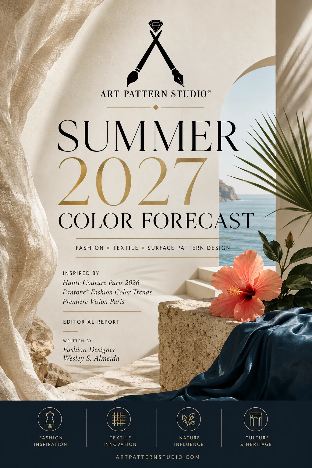
The Summer 2027 Color Forecast is moving beyond one-note minimalism. The season brings quiet luxury into conversation with ocean-inspired calm, botanical renewal, crafted modernity and optimistic color. Instead of asking designers to choose between restraint and expression, the strongest direction is a more useful balance: refined neutrals establish trust, natural greens reconnect products with living systems, and luminous accents create emotion at retail.
Art Pattern Studio developed this independent forecast to help fashion designers, textile teams, surface pattern designers, interior professionals and creative brands translate broad cultural signals into practical color decisions. The palette is informed by public fashion and textile research, runway observation, natural materials, architecture, art and changing expectations around emotional well-being. It is not a copy of any single industry report; it is an editorial interpretation designed for collection development.
The result is a ten-color system that can move from resort wear and tailoring to wallpaper, bedding, accessories, packaging and seamless pattern design. Each shade has a commercial role: foundations, supporting mid-tones, fresh transitional colors, high-impact accents and dark anchors. Together, they give brands enough range to build a coherent seasonal story without losing product clarity.
The Creative Direction Behind Summer 2027
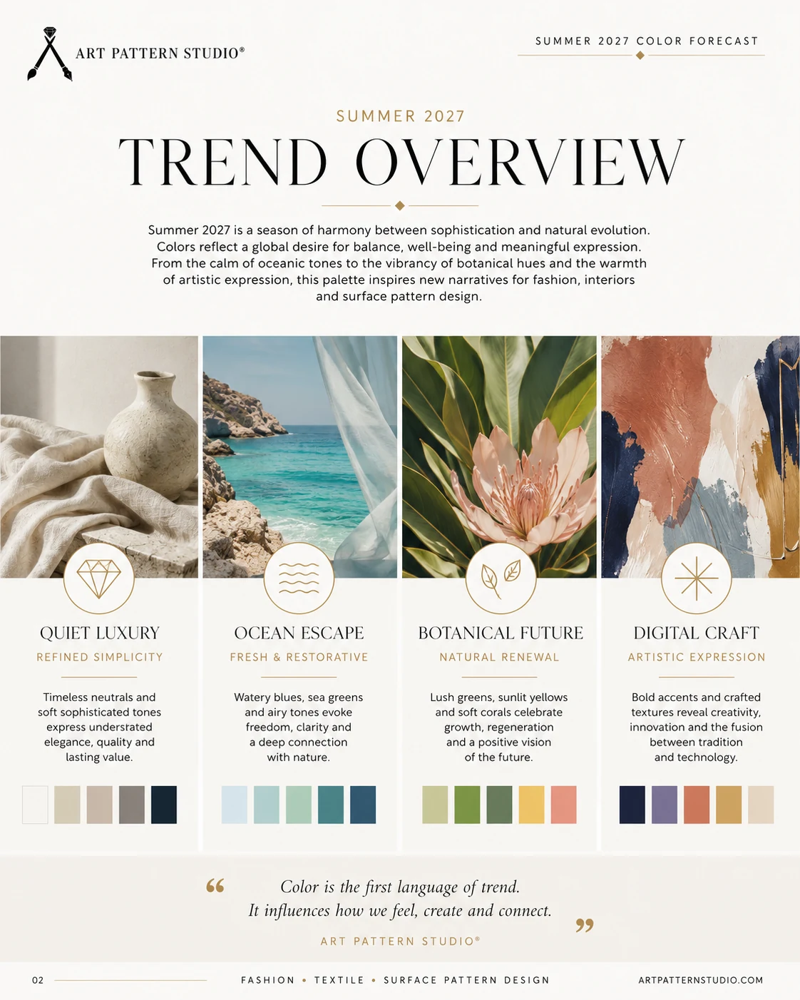
Summer 2027 does not reject minimalism; it makes minimalism more human. Clean lines remain commercially valuable, but their emotional temperature is changing. Pale neutrals feel less clinical when placed beside woven fibers and irregular ceramics. Blue and green are treated as sensory environments rather than generic “natural” colors. Bright accents are deliberate rather than chaotic, while craft and digital tools coexist instead of competing.
This direction aligns with public Spring–Summer 2027 research from Première Vision, which describes a season shaped by radiant vitality, tactile pale tones, material stability and deeply pigmented organic color. Art Pattern Studio interprets those broad signals through four creative territories.
Quiet Luxury
Quiet luxury remains relevant because it gives products longevity. For Summer 2027, however, it is less about anonymous beige and more about discernible material quality. Sea Salt and Sand Dune gain interest through linen slubs, dry cotton, washed silk, hand-finished ceramic and subtle tonal repeats. The most convincing applications use scale, texture and construction to communicate value rather than relying on visible status codes.
Ocean Escape
Aquatic color answers the desire for freedom, freshness and psychological space. Lagoon Mist evokes shallow water and translucent glass, while Ocean Depth and Midnight Navy introduce confidence. Layered transparencies, flowing silhouettes, wave-like repeats and reflective finishes make this family especially relevant for resort wear, swimwear, wellness packaging and coastal interiors.
Botanical Future
Botanical color is shifting from passive “eco” styling toward regeneration and growth. Botanical Sage acts as a flexible mid-tone, but its strongest use is alongside living brights such as Coral Bloom and Sunlit Honey. Hand-drawn flowers, enlarged petals, seed forms, foliage and abstract organic geometry can express optimism without becoming nostalgic.
Crafted Modernity
Crafted modernity places human judgment at the center of technology. Digital tools can accelerate repeat building, color trials and product visualization, while the designer still controls proportion, rhythm and emotional meaning. Terracotta Clay, woven neutrals, painterly marks and imperfect edges give this territory warmth. The outcome is modern, but never sterile.
The Top 10 Colors Defining the Summer 2027 Color Forecast
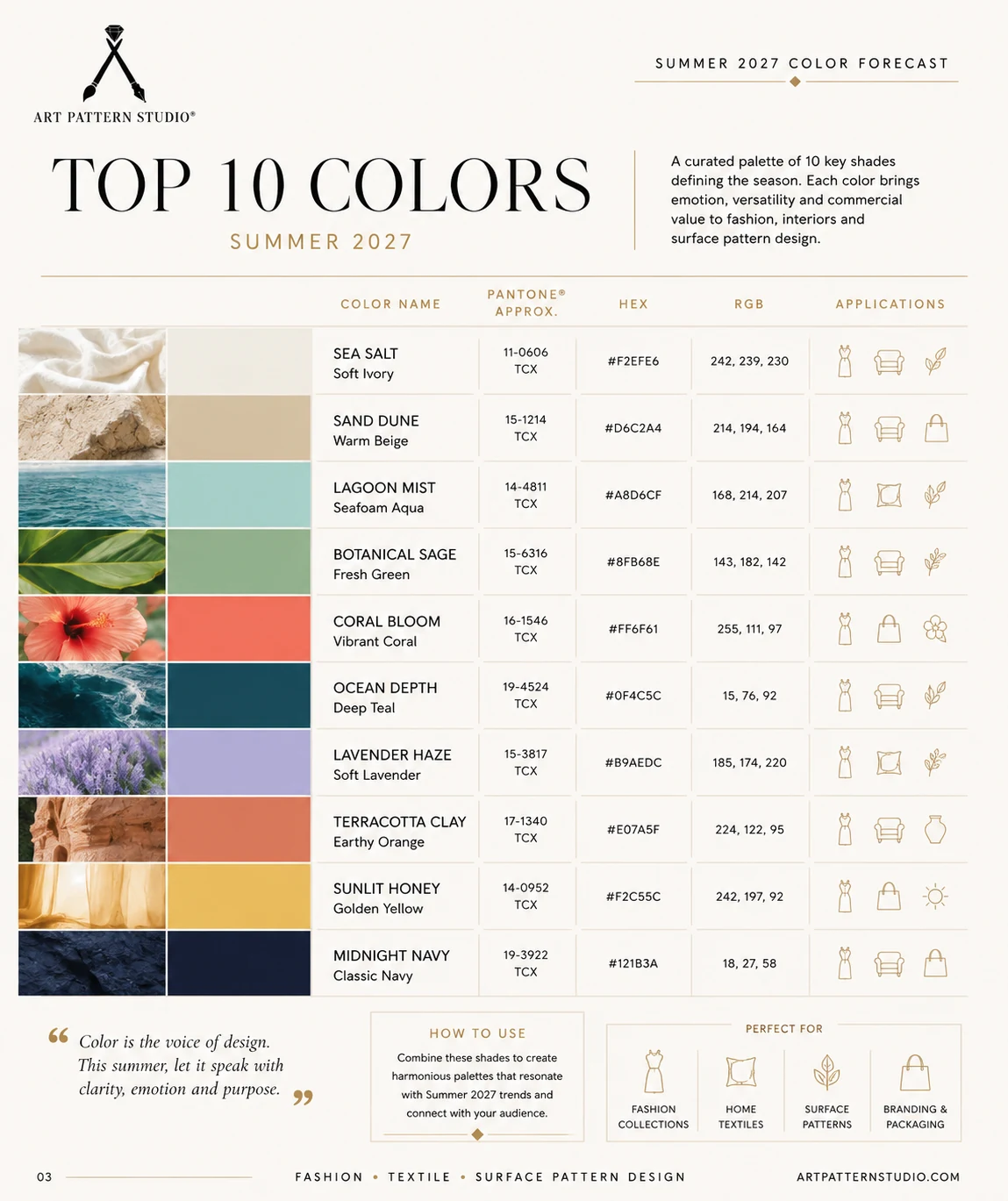
The ten colors below form the Art Pattern Studio seasonal edit. The Pantone references are approximate visual guides, not official matches or licensed specifications. Always approve physical color on the final fabric, paper, coating or production material.
1. Sea Salt
Approximate Pantone reference: 11-0606 TCX · HEX: #F2EFE6 · RGB: 242, 239, 230
Sea Salt is a softly illuminated off-white that gives a collection breathing room. It is ideal for premium foundations, negative space in prints, linen coordinates, bridal-adjacent resort pieces and calm interior backgrounds. Pair it with Midnight Navy for graphic clarity, Sand Dune for tonal sophistication or Coral Bloom for a warm modern contrast.
2. Sand Dune
Approximate Pantone reference: 15-1214 TCX · HEX: #D6C2A4 · RGB: 214, 194, 164
Sand Dune is a warm beige with enough depth to feel material rather than blank. It supports tailoring, handbags, upholstery, woven textures, packaging and gender-inclusive lifestyle ranges. Use it with Lagoon Mist for Mediterranean freshness, Terracotta Clay for artisanal warmth or Ocean Depth for a dependable premium combination.
3. Lagoon Mist
Approximate Pantone reference: 14-4811 TCX · HEX: #A8D6CF · RGB: 168, 214, 207
Lagoon Mist introduces clarity without the predictability of a conventional pastel blue. Its green undertone works beautifully in swimwear, spa textiles, translucent packaging, bedding and wallpaper. Combine it with Ocean Depth for tonal dimension, Coral Bloom for an energetic resort story or Sea Salt for clean visual lightness.
4. Botanical Sage
Approximate Pantone reference: 15-6316 TCX · HEX: #8FB68E · RGB: 143, 182, 142
Botanical Sage is a renewed natural mid-tone: calm enough for broad surfaces, yet sufficiently colored to stand apart from greyed neutrals. It suits florals, childrenswear, kitchen textiles, ceramics, wellness products and upholstery. Pair it with Sunlit Honey for optimism, Lavender Haze for creative softness or Midnight Navy for a more architectural result.
5. Coral Bloom
Approximate Pantone reference: 16-1546 TCX · HEX: #FF6F61 · RGB: 255, 111, 97
Coral Bloom is the emotional accelerator of the palette. It brings warmth to fashion prints, beauty packaging, beach accessories, floral statements and social-first products. Use it strategically as a focal color with Sea Salt and Sand Dune, or intensify it with Terracotta Clay and Sunlit Honey for a saturated summer narrative.
6. Ocean Depth
Approximate Pantone reference: 19-4524 TCX · HEX: #0F4C5C · RGB: 15, 76, 92
Ocean Depth is a blue-green anchor with strong commercial versatility. It can replace black in resort tailoring, premium activewear, men’s accessories, geometric prints and hospitality interiors. Lagoon Mist creates a controlled tonal story, while Coral Bloom and Sunlit Honey provide high-visibility accents without weakening its sophistication.
7. Lavender Haze
Approximate Pantone reference: 15-3817 TCX · HEX: #B9AEDC · RGB: 185, 174, 220
Lavender Haze balances digital freshness with a tactile, almost powdered softness. It is effective for lightweight knits, lingerie, stationery, beauty, youth-oriented interiors and ethereal floral prints. Ground it with Sand Dune, cool it with Lagoon Mist or place it against Midnight Navy to create a sharper and more contemporary expression.
8. Terracotta Clay
Approximate Pantone reference: 17-1340 TCX · HEX: #E07A5F · RGB: 224, 122, 95
Terracotta Clay connects color to touch, heat and handmade surfaces. It has clear applications in ceramic-inspired patterns, leather goods, woven home décor, packaging and transitional apparel. Combine it with Sand Dune for craft-led restraint, Coral Bloom for expressive warmth or Ocean Depth for a rich complementary contrast.
9. Sunlit Honey
Approximate Pantone reference: 14-0952 TCX · HEX: #F2C55C · RGB: 242, 197, 92
Sunlit Honey delivers optimism in a warmer and more wearable way than neon yellow. It is suitable for childrenswear, summer checks, botanical prints, kitchen products, accessories and cheerful packaging. Botanical Sage creates a natural story, Coral Bloom adds energy, and Midnight Navy gives the shade a confident graphic frame.
10. Midnight Navy
Approximate Pantone reference: 19-3922 TCX · HEX: #121B3A · RGB: 18, 27, 58
Midnight Navy is the palette’s primary dark neutral. It supports luxury monograms, tailoring, evening resort pieces, wallpaper and premium branding while allowing other colors to remain luminous. Use it instead of pure black with Sea Salt, Lagoon Mist, Sunlit Honey or Coral Bloom when the objective is depth with a softer visual edge.
Trademark and methodology note: Pantone® is a registered trademark. The Pantone references included in this report are approximate visual references used for design guidance. Art Pattern Studio is not affiliated with or endorsed by Pantone or Première Vision. The palette is an independent trend analysis interpreted by Art Pattern Studio.
The Visual Influences Behind the Palette
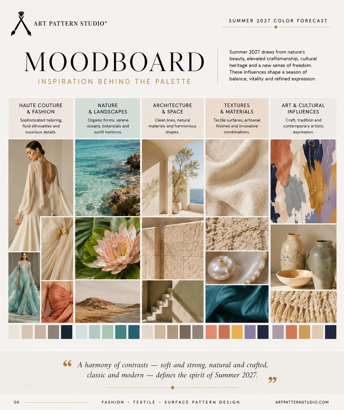
Haute Couture and Fashion
Public Spring 2026 couture coverage reveals the continuing importance of fluid silhouettes, transparency, disciplined tailoring, embroidery and emotionally charged color. The official Fédération de la Haute Couture et de la Mode calendar documents a season spanning established members, corresponding members and invited houses, while the Vogue Runway couture archive provides a broad public visual record. Art Pattern Studio used these sources as observation points, not as a claim that any single runway established this palette.
Nature and Landscapes
Oceans, coastal vegetation, flowers, desert surfaces, sunlight and minerals supply both color and structure. The research looks at how light changes a hue across water, stone, petals and dry fibers. That variability matters for surface design because a successful palette must work in flat digital artwork and on materials with texture, sheen or absorbency.
Architecture and Space
Mediterranean architecture contributes chalky walls, curved forms, shaded passages and the contrast between warm stone and deep blue. These references help designers build palettes with hierarchy: pale architectural foundations, natural mid-tones and concentrated dark accents. The same method works in interiors, fashion ranges and packaging systems.
Textures and Materials
Linen, cotton, silk, ceramic and natural fibers make color feel specific. Première Vision’s public Spring–Summer 2027 fabric analysis highlights lightweight tailoring, pure linen, airy shirting and expressive silk surfaces. Those material directions informed the balance between quiet neutrals, translucent aquatic hues and stronger accents in this report.
Art and Cultural Influences
Abstract painting, hand-drawn marks, cultural heritage and intentional imperfection prevent the palette from becoming a mechanical trend formula. The goal is not to imitate a source image, but to understand the relationship between gesture, proportion and color. This is where a brand can move from a shared seasonal signal toward a distinctive visual language.
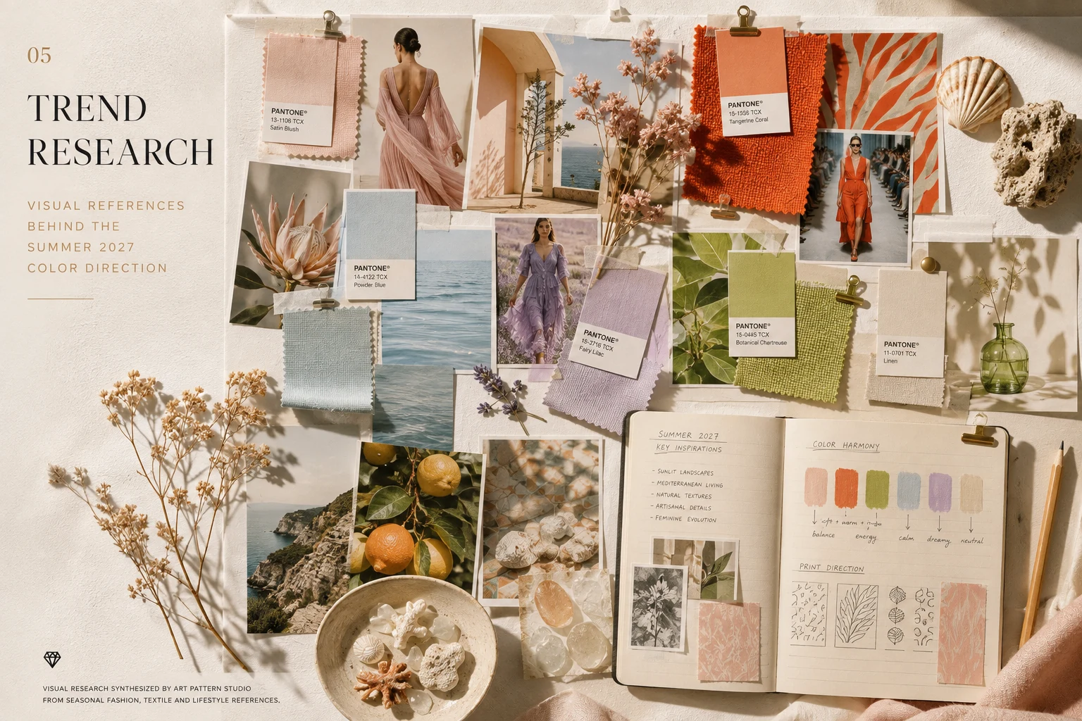
From Research to Color Direction
A professional forecast becomes useful only when observation is translated into decisions. A large moodboard may be inspiring, but product teams need a smaller system with clear roles, compatible harmonies and enough contrast to build a range. The Art Pattern Studio process follows eight stages:
- Cultural research: identify changes in behavior, emotion, visual culture and lifestyle.
- Runway observation: study public collection imagery for shifts in color, silhouette, print, transparency and surface.
- Material selection: connect color to linen, cotton, silk, ceramic, paper and other realistic production substrates.
- Behavior analysis: consider how customers may seek calm, optimism, identity, durability or sensory pleasure.
- Chromatic grouping: separate foundations, mid-tones, accents and dark anchors.
- Harmony building: test tonal, complementary and high-contrast combinations.
- Pattern application: evaluate the colors across florals, geometry, monograms, dots, stripes and organic repeats.
- Commercial validation: check readability, versatility, category fit and consistency across a product range.
This report is an independent interpretation intended to guide designers and brands. It should be combined with market knowledge, customer data, supplier capabilities and physical sampling. A forecast narrows possibilities; it does not replace creative direction.
How to Use the Summer 2027 Palette
Fashion Collections
For resort wear and swimwear, begin with Lagoon Mist, Ocean Depth and Sea Salt, then introduce Coral Bloom as a focal accent. Womenswear can move between Lavender Haze softness and Terracotta Clay warmth, while menswear benefits from Sand Dune, Botanical Sage and Midnight Navy. Childrenswear can use Sunlit Honey and Coral Bloom in controlled proportions. Activewear requires sharper contrast, and accessories offer the strongest opportunity for monograms, engineered graphics and concentrated color.
Textile and Surface Pattern Design
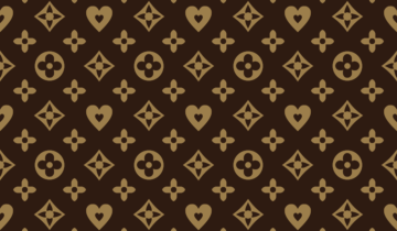
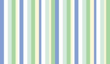
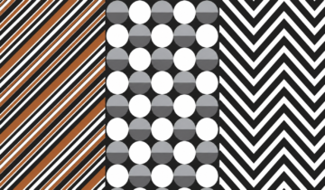
Florals can combine Botanical Sage, Coral Bloom and Sunlit Honey, while animal prints gain freshness when black is replaced by Ocean Depth or Midnight Navy. Geometric patterns and polka dots work well in Sea Salt with a single saturated contrast. Luxury monograms benefit from Sand Dune and Midnight Navy; stripes can move from resort combinations to stronger urban palettes. Abstract and tropical repeats allow the full range to interact through scale, transparency and irregular mark-making. For more practical print guidance, explore the Art Pattern Studio Blog.
Home Decor and Interiors
Use Sea Salt and Sand Dune for large upholstered surfaces, curtains and bedding, then add Ocean Depth or Terracotta Clay through cushions, borders and ceramics. Wallpaper can carry more complex combinations when the repeat includes sufficient negative space. Botanical Sage offers an adaptable bridge between warm wood, stone and color. The palette is especially effective for boutique hospitality, wellness environments and residential collections seeking calm without visual anonymity.
Branding and Packaging
Beauty, fashion, lifestyle, stationery and wellness brands can use the palette as a modular identity system. Sea Salt creates premium space, Midnight Navy establishes authority, and Coral Bloom or Sunlit Honey improves shelf recognition. Terracotta Clay communicates craft, while Lagoon Mist suggests freshness. Always test accessibility, print conversion and material finish; a color that works on screen may shift significantly on uncoated paper, recycled board or metallic film.
Recommended Summer 2027 Color Combinations
Quiet Resort
Sea Salt + Sand Dune + Lagoon Mist + Midnight Navy — ideal for refined resort wear, coastal interiors, premium swim accessories and calm geometric repeats.
Botanical Optimism
Botanical Sage + Sunlit Honey + Coral Bloom + Sea Salt — designed for florals, childrenswear, wellness packaging, kitchen textiles and upbeat lifestyle collections.
Mediterranean Escape
Lagoon Mist + Ocean Depth + Sand Dune + Coral Bloom — a balanced direction for swimwear, hospitality, ceramic-inspired surfaces and travel-focused products.
Soft Creative
Lavender Haze + Sea Salt + Sand Dune + Botanical Sage — effective for beauty, stationery, bedding, delicate florals and softly expressive youth markets.
Expressive Summer
Coral Bloom + Terracotta Clay + Sunlit Honey + Midnight Navy — a confident mix for statement fashion prints, packaging, accessories and editorial product capsules.
Editable Seamless Patterns for Your 2027 Collections
Every seamless pattern available at Art Pattern Studio is professionally developed and designed to support color customization. Designers can adapt the artwork to their own seasonal palette while preserving a clean and accurate repeat.
Available formats vary by product and may include AI, EPS, SVG, JPG, PNG or PSD files where specified. Review each listing before purchase to confirm its contents and editing compatibility. The catalog includes vector and high-resolution raster artwork, accurate seamless repeats and Personal, Commercial and Extended licensing options. For production rights and usage limits, consult the Pattern Licensing Guide.
- Animal Print Collection
- Floral Pattern Collection
- Polka Dot Collection
- Heritage Pattern Collection
- Abstract Pattern Collection
- Luxury Monogram Patterns
Follow Art Pattern Studio for More Trend Forecasts
Follow Art Pattern Studio on Instagram for seasonal color forecasts, seamless pattern inspiration, fashion research, textile trends and behind-the-scenes creative content.
FOLLOW FOR:
Weekly color inspiration
Seamless pattern trends
Fashion and textile research
New collection previews
Free creative resources
Build Your Next Collection with Art Pattern Studio
Explore professional seamless patterns created for fashion, textiles, home decor and product design. Every collection is designed to help creative professionals move from inspiration to production.
GET 50% OFF YOUR FIRST PURCHASE
Use coupon code FIRSTBUY at checkout.
Offer subject to the current terms displayed on the Art Pattern Studio website.
Frequently Asked Questions
What are the key colors for Summer 2027?
The Art Pattern Studio forecast highlights Sea Salt, Sand Dune, Lagoon Mist, Botanical Sage, Coral Bloom, Ocean Depth, Lavender Haze, Terracotta Clay, Sunlit Honey and Midnight Navy. Together they balance refined neutrals, natural mid-tones, expressive accents and dark anchors.
How can designers use the Summer 2027 color palette?
Use the palette to build collection moodboards, recolor seamless patterns, plan coordinated product ranges and define foundations, accents and contrast colors. Physical production should always be approved on the final material.
Are the Pantone references in this forecast official?
No. They are approximate visual references used for design guidance. This is an independent Art Pattern Studio trend analysis and is not an official Pantone or Première Vision palette.
Which patterns are expected to be relevant in 2027?
Hand-drawn florals, oversized botanical motifs, aquatic organic forms, refined geometrics, updated checks, stripes, polka dots, luxury monograms and expressive abstract patterns all offer relevant directions when adapted to the product and target market.
Can Art Pattern Studio patterns be recolored?
Art Pattern Studio patterns are professionally developed to support color customization. Editing options depend on the files included with each product, so review the individual listing before purchasing.
Which file formats are included with the patterns?
Formats vary by product and may include AI, EPS, SVG, JPG, PNG or PSD files where specified. Each product page identifies the supplied files and their intended editing workflow.
What type of license do I need?
Choose a Personal License for eligible non-commercial use, a Commercial License for covered business production, or an Extended License for broader production and distribution. Review the current Licensing Guide for the controlling terms.
Where can I find more color and print forecasts?
Visit the Art Pattern Studio Blog and follow Art Pattern Studio on Instagram for seasonal color reports, textile research, seamless pattern inspiration and new collection previews.
Research Sources and Independent Interpretation
This report was informed by public industry material available at the time of publication, including the Pantone Fashion Colour Trend Report for London Fashion Week Spring/Summer 2026, Première Vision’s public SS27 color direction, its SS27 fabric decodings and SS27 decoration analysis, alongside the official Haute Couture Spring–Summer 2026 calendar and public runway coverage from Vogue Runway.
The final palette, color names, combinations and commercial applications are interpreted by Art Pattern Studio through independent trend analysis. They are intended to support creative planning, not to represent an official forecast from any referenced organization.
About the Author
Written by Fashion Designer and Surface Pattern Designer Wesley S. Almeida
Founder of Art Pattern Studio
Wesley S. Almeida is a fashion and surface pattern designer with experience developing prints for fashion and lifestyle products. His designs have achieved more than 5,000 downloads worldwide through international creative platforms. Learn more on the About the Founder page.
 No products in the cart.