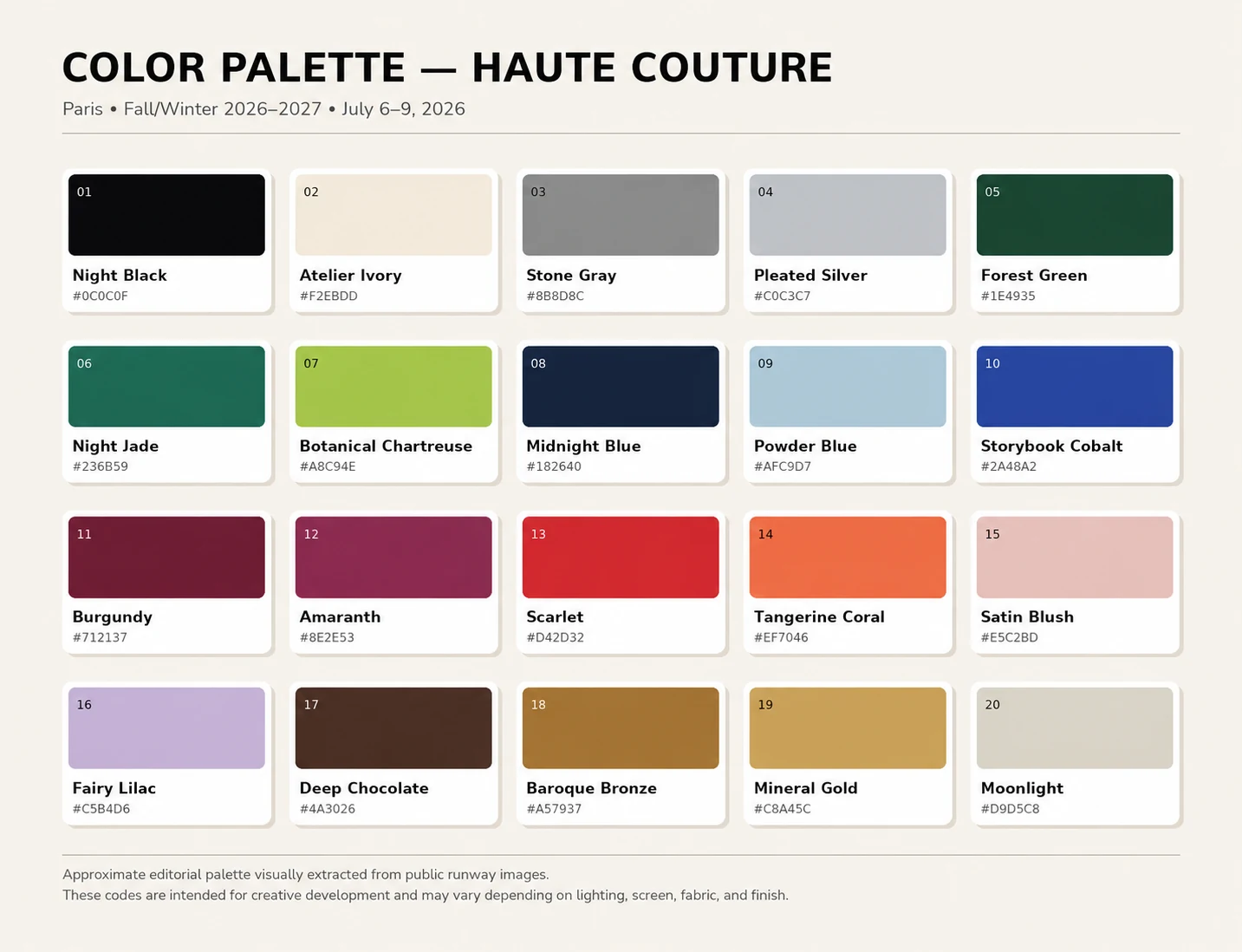
Haute couture is where color is allowed to behave as material. A black can become lacquer, velvet, shadow or polished tailoring; a green can suggest an enchanted garden, a mineral surface or a flash of modern acidity. Because couture collections concentrate craft, construction and visual narrative at their highest level, they are a useful laboratory for designers planning the next season of fashion, textiles, accessories and interiors.
The Haute Couture color trends Fall Winter 2026 2027 palette presented here is an independent Art Pattern Studio edit developed after reviewing public runway imagery and official collection materials from Paris. It brings together 20 colors that can help creative teams move from observation to practical development: deep neutrals, nocturnal greens and blues, intense reds, softened pastels and metallic-inspired earth tones.
Use the palette as a starting point for collection moodboards, print recoloring, digital fashion, fabric concepts, wallpaper, packaging and product development. The HEX values are intended for digital exploration; physical production should always be checked against the final material, print process and approved color standard.
Download the Free Haute Couture Color Palette
Save the complete Fall/Winter 2026–2027 palette with 20 curated fashion colors and HEX codes. Use it as a starting point for prints, textiles, apparel, accessories, branding, home décor and product development.
New to Art Pattern Studio? Use code FIRSTBUY to save 50% on your first pattern purchase. Products already on sale are excluded.
Haute Couture Fall/Winter 2026–2027 Color Overview
The official Paris Haute Couture calendar ran from July 6 to July 9, 2026, according to the Fédération de la Haute Couture et de la Mode. Across the week, color often worked through contrast: shadowed foundations gave brighter pigments room to feel deliberate, while pale mineral tones and softened pastels interrupted the season’s depth.
Surface and narrative were equally important. Dior’s official collection notes, for example, connect hand-pleating, knotting and sculptural form with brightly colored floral embellishment, historic chintz and contrasting landscapes. That relationship between color, craft and print is especially relevant for surface pattern designers: a palette becomes stronger when it is tied to scale, material, repeat and the emotional role of the finished product.
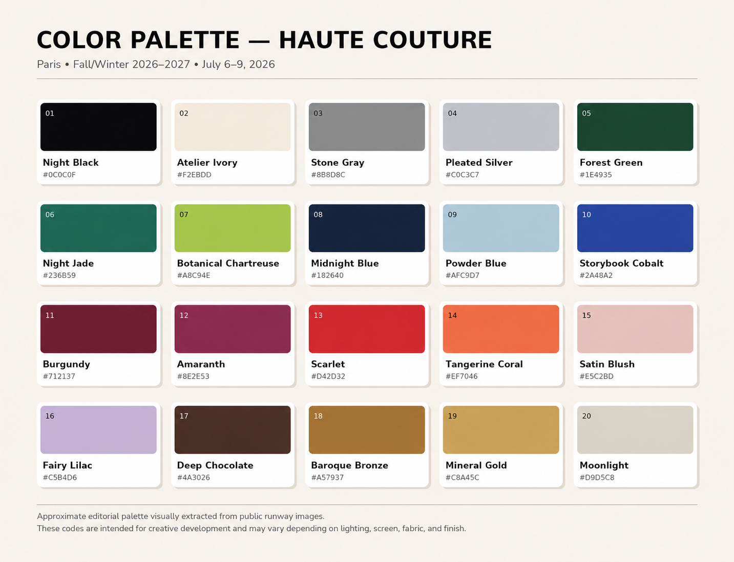
Methodology note: this is an independent editorial palette visually interpreted from publicly available runway imagery. It is not an official FHCM, Pantone or fashion-house color standard. Screen, lighting, fabric and finish will affect the result.
The 20-Color Palette at a Glance
| Color | HEX reference |
|---|---|
| Night Black | #0C0C0F |
| Atelier Ivory | #F2EBDD |
| Stone Gray | #8B8D8C |
| Pleated Silver | #C0C3C7 |
| Forest Green | #1E4935 |
| Night Jade | #236B59 |
| Botanical Chartreuse | #A8C94E |
| Midnight Blue | #182640 |
| Powder Blue | #AFC9D7 |
| Storybook Cobalt | #2A48A2 |
| Burgundy | #712137 |
| Amaranth | #8E2E53 |
| Scarlet | #D42D32 |
| Tangerine Coral | #EF7046 |
| Satin Blush | #E5C2BD |
| Fairy Lilac | #C5B4D6 |
| Deep Chocolate | #4A3026 |
| Baroque Bronze | #A57937 |
| Mineral Gold | #C8A45C |
| Moonlight | #D9D5C8 |
Couture Neutrals: Structure Before Decoration
Night Black, Atelier Ivory, Stone Gray, Pleated Silver and Moonlight create the architecture of the palette. They are not filler colors. Each carries a different surface association: black suggests lacquer and velvet; ivory recalls atelier calico and archival paper; gray and silver connect to sculptural pleating, metal and polished embellishment; Moonlight softens the transition between warm and cool.
For fashion, these shades support tailoring, eveningwear, monochromatic prints and luxury basics. In packaging and interiors, they allow texture and form to lead. A black-and-ivory direction is particularly effective for geometric repeats, dots and heritage checks. The Black and White Houndstooth Seamless Pattern is a useful base for testing a sharper couture-neutral story.
Botanical Greens: From Forest Depth to Acid Light
Forest Green, Night Jade and Botanical Chartreuse move through three levels of botanical intensity. Forest Green is grounded and luxurious; Night Jade feels mineral and nocturnal; chartreuse acts as a living highlight. Together, they can describe an enchanted garden without relying on a conventional floral palette.
Use the darker greens for foliage, ornamental backgrounds and premium interiors, then reserve chartreuse for small motifs, outlines or an unexpected coordinate. The relationship is commercial because the deep tones carry longevity while the brighter accent signals the season. Designers can test the family on the Green Minimalist Floral Seamless Pattern or browse the Floral Pattern Collection for other botanical foundations.
Midnight and Storybook Blues
Midnight Blue, Powder Blue and Storybook Cobalt create a complete blue narrative rather than a single trend color. Midnight Blue gives evening collections the authority of black with a softer chromatic edge. Powder Blue introduces air and distance. Storybook Cobalt supplies the visual punctuation.
This range works well for narrative florals, heritage prints, geometric repeats, menswear and accessories. In a print collection, cobalt is strongest when controlled: one vivid motif against midnight, a narrow stripe, or a border on a scarf can feel more sophisticated than an evenly distributed bright blue.
Burgundy, Amaranth and Scarlet
Burgundy, Amaranth and Scarlet form the dramatic center of the palette. Burgundy brings depth and familiarity; Amaranth introduces a cooler, more cosmetic intensity; Scarlet delivers immediate impact. Used together, they can move from dark romance to sharply modern color blocking.
These shades suit dark florals, baroque motifs, eveningwear, statement accessories and packaging that needs high perceived value. A useful hierarchy is to let burgundy hold the largest area, use amaranth for secondary motifs and reserve scarlet for the focal point. This prevents the composition from becoming visually loud while preserving its emotional charge.
Tangerine and Powdery Pastels
Tangerine Coral, Satin Blush and Fairy Lilac stop the season from becoming uniformly dark. Tangerine Coral creates warmth and movement; Satin Blush introduces a polished softness; Fairy Lilac adds a cool, imaginative note. They can soften black, chocolate and midnight blue or make classic motifs feel newly seasonal.
For fashion and home décor, these colors are useful in delicate florals, kidswear, stationery, bedding and small accessories. They also create commercially approachable colorways when paired with ivory rather than pure white. The key is restraint: pastels read as couture when balanced with precise structure, material contrast or a darker anchor.
Metallic and Earthy Luxury
Deep Chocolate, Baroque Bronze and Mineral Gold translate metallic and artisanal references into colors that can be used beyond literal foil or embroidery. Chocolate gives warmth to the foundation; bronze feels aged and ornamental; gold becomes a controlled highlight rather than an all-over effect.
This family works naturally with animal patterns, monograms, heritage motifs, accessories, wallpaper and premium packaging. Apply Mineral Gold to a key emblem, use bronze for the supporting lattice and allow chocolate or black to carry the field. The Royal Crown Honey Bee Monogram Seamless Pattern offers a strong structure for exploring that hierarchy.
How to Use the Haute Couture Color Palette
- Build a hierarchy: choose one foundation, one supporting color and one accent before adding more shades.
- Test print scale with color: a bright accent expands visually, while a deep ground can make the same motif appear more contained.
- Create seasonal colorways: recolor one repeat in a neutral, botanical, jewel-tone and pastel direction to evaluate the market range.
- Check the final substrate: coated paper, silk, cotton, wallpaper and screens will not reproduce a color identically.
- Prepare production standards: convert digital references to the appropriate CMYK, Pantone or supplier system and approve physical samples before volume production.
HEX codes are most useful during digital concept development, presentation and early mockups. They are not a substitute for production color management. Fabric fiber, ink, surface texture, finish and lighting can all shift the result. A strike-off, lab dip or physical prototype remains essential when color accuracy affects the commercial product.
Recolor Any Art Pattern Studio Design for Your Collection
Art Pattern Studio designs are developed to support color adaptation, allowing fashion and product teams to align a repeat with a seasonal palette or brand direction. Exact file formats vary by product, so review each listing before purchase. Where an editable vector format is stated, colors can be adjusted with greater control; high-resolution raster files can also support selected recoloring workflows.
Designers can apply this couture-inspired palette to create seasonal versions, coordinated product families or market-specific colorways across fashion, textiles, accessories and interiors. Choose the pattern you love, apply the colors your collection needs and create a result that feels entirely your own.
Before production, confirm the included files and select the usage rights that match the project. The Art Pattern Studio Licensing Guide explains Personal, Commercial and Extended options, while the editorial guide to Commercial vs Extended pattern licenses helps buyers plan for production scale and distribution.
Find the Right Pattern for Your Next Collection
Use the palette across different print families to see how color changes the commercial role of a design. For a broader selection framework, read how to choose seamless patterns for fashion collections and explore the collections below.
Get 50% Off Your First Order
Start your next collection with professionally developed seamless patterns. Use code FIRSTBUY and receive 50% off your first purchase at Art Pattern Studio. The offer is limited to eligible first orders, cannot be combined with another coupon and excludes products already on sale.
Frequently Asked Questions
What are the key Haute Couture color trends for Fall/Winter 2026–2027?
The Art Pattern Studio edit highlights deep couture neutrals, botanical greens, midnight and cobalt blues, burgundy and scarlet reds, tangerine, powdery pastels, chocolate, bronze, gold and silver-inspired tones. It is an independent editorial interpretation rather than an official fashion-house or Pantone palette.
Can I download the Haute Couture color palette for free?
Yes. The high-resolution PNG and a CSV list of the 20 HEX references are available from the download section near the beginning of this article.
Can these colors be used for textile and surface pattern design?
Yes. Use them for digital development, print recoloring, moodboards and product concepts. For physical production, convert the references to the color system required by your supplier and approve a strike-off or sample.
Can Art Pattern Studio patterns be recolored?
Art Pattern Studio designs are developed to support color adaptation. The exact editing workflow depends on the files included with each product, so check the individual listing before purchase.
Which file formats are included with the patterns?
File formats vary by product. Listings identify the supplied high-resolution raster files and any editable vector formats. Always review the product description and included-file details before purchasing.
Can the patterns be used in commercial fashion collections?
Yes, when the selected Commercial, Extended or custom license covers the intended products, production volume and distribution. The original source artwork may not be resold or redistributed.
What is the difference between Personal, Commercial and Extended licenses?
Personal rights are for non-commercial projects. Commercial rights cover eligible business use within defined limits, while Extended rights are intended for broader production or distribution. Review the current Licensing Guide for the controlling terms.
How do I get 50% off my first Art Pattern Studio purchase?
Use coupon code FIRSTBUY during checkout to receive 50% off your eligible first purchase. The coupon is limited to one use per user, cannot be combined with another coupon and excludes products already on sale.
Ready to Create Your Next Collection?
Explore editable seamless patterns developed for fashion, textiles, accessories and home décor. Recolor your chosen design using the Haute Couture palette and adapt it to your brand’s creative direction. Get 50% off your eligible first purchase with code FIRSTBUY.
 No products in the cart.