ART PATTERN STUDIO — INDEPENDENT DESIGN DIRECTIONS
Stripe pattern trends 2027: an editorial guide for fashion designers, textile teams and creative brands.
Stripes do not need to be reinvented to feel new. Change the distance between lines, introduce an unexpected color, interrupt a regular rhythm or shift a band from delicate to commanding, and a familiar pattern acquires a different commercial purpose. That adaptability makes stripes valuable beyond a single season.
For 2027, the useful question is not whether stripes are fashionable, but which stripe language belongs in your collection. A fine pinstripe can support contemporary tailoring; a pastel multistripe can connect resort apparel with bedding; a bold, uneven band can give an accessory a recognizable graphic identity.
This guide combines public textile and runway research with Art Pattern Studio’s independent recommendations. The ten directions below are creative development routes, not ten universally confirmed industry forecasts. Explore our Striped Patterns collection alongside the practical advice, comparing scale, spacing, line weight, contrast and color before selecting your digital artwork.
Why Stripes Remain Timeless
Stripes connect several enduring design traditions: tailored suiting, everyday shirting, maritime-inspired casualwear and graphic decoration. Their appeal is structural. Unlike a figurative motif, a stripe can establish order without prescribing a particular story, allowing brands to adapt it to different seasons, audiences and product categories.
Commercial longevity comes from that flexibility, not from a guarantee of sales. A striped fabric pattern may serve as a statement print on a dress, then become a quieter coordinate for a floral capsule or a lining within a tailored range. Altering the proportion of background to colored line can change its visual weight without changing its identity.
Orientation also matters. Vertical arrangements can emphasize the length of a panel; horizontal bands can articulate its breadth; diagonals create movement or a chevron when mirrored. These are compositional effects, not universal rules about making bodies appear smaller or larger. Garment shape, stripe width, fit, drape and placement all affect perception.
For textile and surface design, the same clarity transfers to cushions, wallpaper, stationery and packaging. A good stripe can anchor a collection while more expressive artwork supplies its narrative.
The Research Context for Stripe Textile Trends
In its Spring–Summer 27 fabrics analysis, Première Vision describes lightweight tailoring and fluid shirting, including striped references adapted to silk and blended fabrics. Its shirting discussion also identifies textured, small-scale stripe effects. This provides a material context for developing both precise and softer line systems.
Première Vision’s transversal SS27 highlights explicitly include bold stripes alongside vivid color and describe refreshed, lighter tailoring. Separately, Wallpaper*’s original New York S/S 2027 reporting places stripes within Michael Kors’ architectural approach to line and color.
Our interpretation is that refinement and graphic expression can coexist. The following proposals translate those signals and established stripe vocabulary into usable collection decisions; they are not claims that every palette or stripe type appeared in those sources.
Key Stripe Directions for 2027
1. Refined Pinstripes
Fine, clearly separated lines create a measured, tailored impression. Consider ivory on navy, soft gray on charcoal or blush against white for a gentler interpretation. This direction suits professional wardrobes, premium shirting and brands balancing formality with ease. Lightweight wool, cotton poplin and stable blends offer useful sampling bases. Keep line thickness printable at the intended scale: a delicate pinstripe pattern can disappear when reduced, while tight repeats may become visually noisy in photography.
2. Fine Minimal Stripes
Minimal stripes use restrained contrast and generous breathing room rather than relying on a formal suiting association. Cream, sage, pale blue and warm gray suggest calm everyday dressing or understated home textiles. Try crisp cotton for shirts and smoother woven bases for bedding concepts, subject to printer compatibility. For design-conscious customers, the appeal is quiet structure. Compare the repeat at arm’s length and across a full surface: fine lines should remain intentional rather than dissolve into an accidental texture.
3. Bold Wide Stripes
Broad bands make the stripe itself the main design event. Black and ivory, deep blue and white, or a concentrated color with a neutral create immediate graphic impact. Resort dresses, expressive accessories and statement cushions are promising development contexts. Cotton canvas, substantial jersey and structured woven fabrics provide different readings of the same artwork. This direction suits brands comfortable with visibility. Map bands onto the actual product: a small bag may show only one stripe, losing the rhythm visible in the repeat tile.
4. Varied-Width Stripes
Alternating broad, narrow and accent lines creates hierarchy without introducing another motif. Choose one dominant band, then let finer lines punctuate it. Cornflower blue, lime or orange against white can make the rhythm legible. This is useful for modern shirting, scarves and coordinated casualwear aimed at color-aware customers. Sample on poplin or a suitable fluid woven base. The repeat boundary must complete the sequence cleanly; a misplaced edge can produce an unintended oversized gap across printed fabric.
5. Multistripes
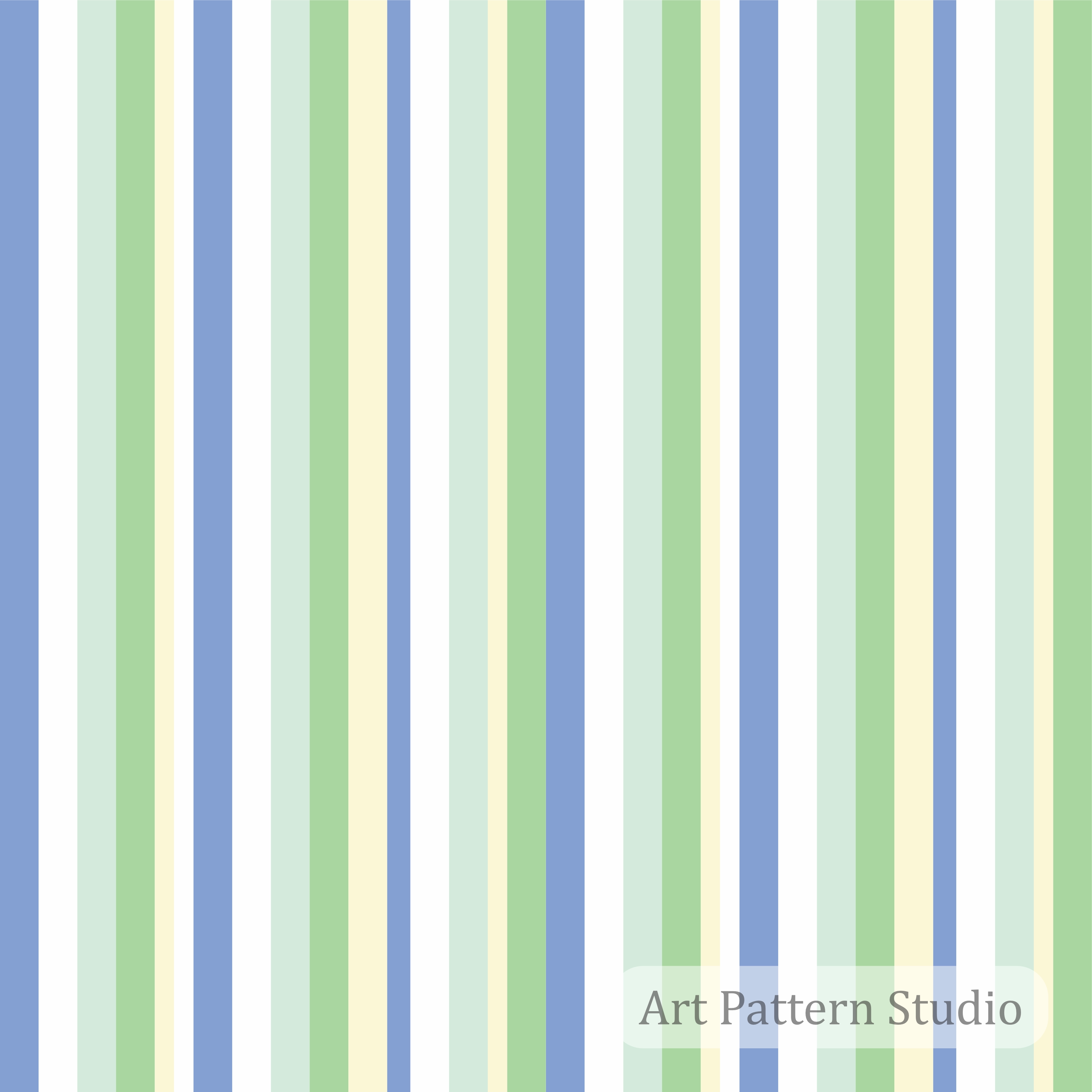
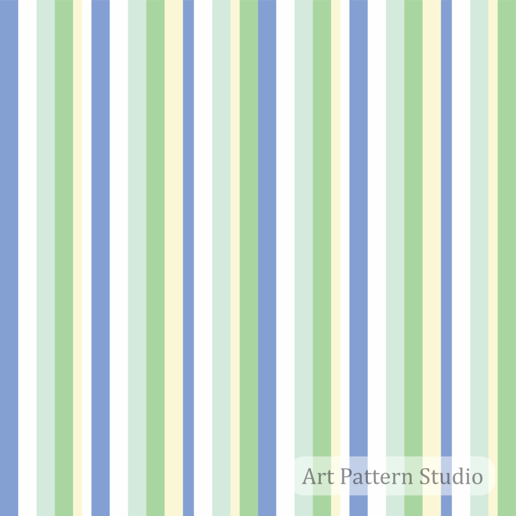
A multistripe combines several colors and often several widths within one repeating sequence. Blue, mint and cream offer a softer route; richer combinations can support energetic seasonal capsules. Consider relaxed shirts, resort separates, accessories and playful interior coordinates for customers who enjoy color without figurative prints. Cotton, viscose blends and lightweight canvas are possible sampling options. Control the area occupied by each hue: equal color widths may feel busy, while a dominant background gives the collection a clearer foundation.
6. Tonal & Neutral Stripes
Close-value colors let line and material share attention. Beige with cream, sage with olive or several warm grays can suit understated apparel, bedding and interior accessories. Linen blends and textured cottons may enrich this direction, but the texture must not erase the printed lines. The potential audience includes brands seeking versatile coordinates rather than statement prints. Test contrast under realistic lighting and across the selected base color; a neutral repeat that looks distinct on screen can become too subtle in production.
7. High-Contrast Graphic Stripes
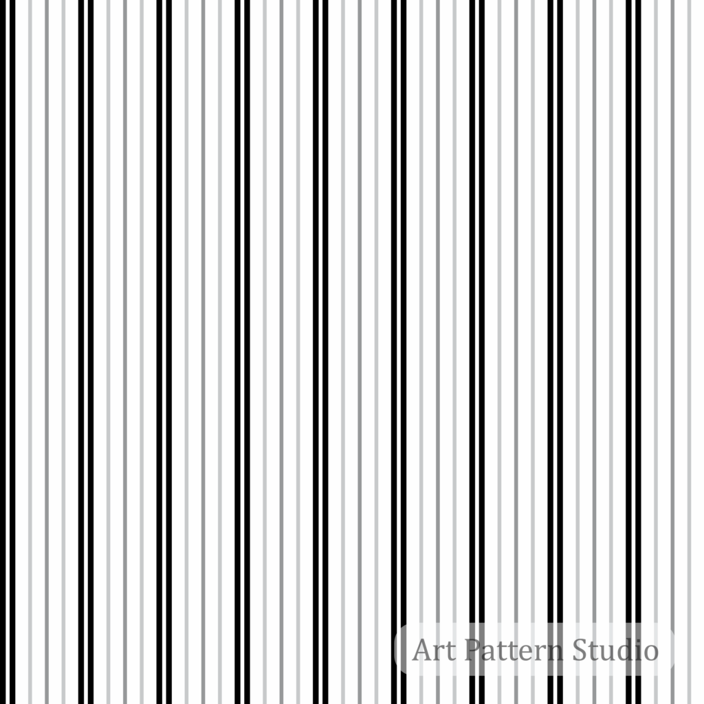
Sharp light–dark relationships bring an architectural quality to striped patterns. Black, white and gray can support fashion accessories, modern wallpaper concepts and packaging for visually confident brands. Smooth woven bases or coated presentation papers can preserve crisp edges; actual substrate approval belongs to the manufacturer. Plan where seams, folds and typography meet the lines. Narrow high-contrast intervals may cause moiré in photographs or screen previews, so inspect both the production sample and the images used to sell the finished product.
8. Color-Driven Stripes
Here, color carries the emotional message while stripes organize it. Coral and orange can feel lively; blue and mint lighter; lime with white more assertive. Use this route for seasonal apparel, swimwear concepts and accessories aimed at expressive customers. Cotton sateen, appropriate swimwear knits and fluid woven materials each require separate print trials. Keep a consistent anchor color across the range. Confirm stretch behavior and color reproduction rather than assuming a digital palette will behave identically on every fiber.
9. Resort & Coastal Stripes
Blue and white, navy and ivory, or sand with cream translate a coastal reference without requiring nautical symbols. The result can be relaxed yet polished for holiday wardrobes, beach accessories and hospitality-inspired textiles. Linen, cotton voile and terry-related product concepts offer contrasting tactile possibilities. Resort customers may value easy coordination, but the same stripe need not suit every destination. Scale bands around pockets, plackets and hems; balanced placement makes familiar coastal stripes feel considered rather than generic.
10. Contemporary Tailoring Stripes
Tailoring stripes can move beyond a rigid office vocabulary through softer color, wider spacing or paired lines. Explore muted green, dusty pink or charcoal with restrained accents for modern separates and gender-inclusive collections. Lightweight suiting, twill and suitable shirting fabrics offer different degrees of structure. This direction suits brands refreshing wardrobe staples. Distinguish printed stripes from yarn-dyed or woven constructions: digital artwork supplies the visual design, not the physical weave. Check alignment across jacket fronts, trousers and coordinated pieces.
Stripes in Fashion: Scale, Proportion and Placement
Start with the garment architecture. On shirting, a stripe meets collars, cuffs, pockets and plackets; a small change in orientation can create a deliberate detail. For dresses, compare the rhythm on the bodice with its movement across a gathered or flared skirt. Wider stripes need enough uninterrupted surface to express their sequence.
In womenswear and menswear, avoid treating one orientation as a fixed rule. Contemporary tailoring may benefit from aligned vertical panels, while a horizontal knit or diagonal insert can provide contrast. Evaluate the silhouette on a representative size range instead of relying on a flat pattern preview.
Resort and swimwear require attention to stretch, seams and the way a band wraps around the body. Accessories introduce another challenge: scarves fold, bags have small panels, and linings reveal only part of a repeat. Select a scale that survives that reduced viewing area.
Build a placement sheet showing stripe direction, repeat dimensions, matching points and acceptable alignment tolerances. That communication is more useful to a production team than a mood board alone. For broader application ideas, explore our fashion textile patterns.
Stripes in Textile & Surface Design
Striped seamless patterns can provide continuity across fabric printing and coordinated surfaces. Check the complete tile sequence at both edges and inspect several repeats together. A visually clean single tile does not reveal every spacing error that appears across a roll of fabric or a wall.
For bedding, decide whether the stripe is the principal duvet design, a reverse-side coordinate or a smaller pillow accent. Cushions and upholstery require planning around seams and panel dimensions. Wallpaper needs a separate scale review at room distance, plus agreement with the supplier about roll width and repeat placement.
Stationery and packaging add typography, logos, folds and trim areas. Use quiet stripe intervals where information must remain readable; reserve stronger bands for decorative surfaces. Never assume that a print-ready file for fabric is automatically ready for a packaging supplier.
Define the target size, substrate, color workflow and finishing requirements first. The digital design is one component of production, not a substitute for sampling and technical approval.
How to Build a Striped Collection
- Define the product category. A shirt, scarf and wallpaper panel need different viewing distances, dimensions and manufacturing decisions.
- Choose the stripe scale. Record line widths and repeat size in physical units, not only in pixels.
- Establish line rhythm. Decide whether the sequence is regular, paired, varied-width or multicolor; keep its logic intentional.
- Create visual hierarchy. Identify the dominant band and supporting accents. Remove lines that compete without adding purpose.
- Build a color system. Select an anchor neutral and a controlled set of accents that connect different products.
- Add complementary coordinates. Introduce a solid, a smaller stripe or another print at a clearly different scale.
- Test the seamless repeat. Inspect joined tiles for doubled lines, incomplete bands and accidental gaps.
- Test several scales. View each version on the actual product area and at realistic customer viewing distances.
- Validate the intended material. Sample color, edge clarity, stretch behavior and any interaction with weave or surface texture.
- Edit the final collection. Retain designs with distinct roles and a shared palette; provide clear production specifications for each.
A compact collection benefits from a clear hierarchy: one hero stripe, a quieter coordinate and a solid foundation can be more coherent than many near-identical alternatives. Keep the strongest repeat recognizable across applications rather than changing every variable at once.
Color Directions for Stripe Trends 2027
The following combinations are APS editorial proposals, not an official universal 2027 palette. Choose according to brand identity, season, customer and substrate. For a wider independent color framework, read our Summer 2027 color forecast.
- Black and white: graphic accessories, sharp coordinates and contemporary packaging.
- Navy and ivory: polished shirting, relaxed tailoring and coastal interiors.
- Beige and cream: understated bedding, soft accessories and neutral apparel.
- Blue and white: fresh shirts, resort separates and bright home textiles.
- Green tonal: layered, quieter color for apparel and botanical-adjacent collections.
- Olive and neutral: grounded casualwear, refined coordinates and natural-material concepts.
- Coral and orange: energetic seasonal accents, expressive scarves and swimwear concepts.
- Pastel multistripes: gentle color stories for relaxed apparel, stationery and bedding.
- High-contrast combinations: statement surfaces where the stripe is the main visual identity.
- Monochrome families: a restrained way to emphasize rhythm without adding many hues.
Judge a palette by proportion as well as hue. A narrow orange accent on cream creates a different message from a broad orange field with white lines. Print a color proof before committing to a production quantity.
Art Pattern Studio Striped Collection: An Editorial Selection
These existing designs illustrate different decisions within stripe surface pattern design. They are examples to compare, not a sales ranking or a prediction that one design will outperform another.
- Striped Pattern 019 – Black Gray Fine Stripe uses dense, narrow dark and gray lines against white. Consider it when a sharper fine-line coordinate is needed.
- Striped Pattern 018 – Pastel Blue Mint Multistripe organizes soft blue, mint and cream into a readable color sequence, offering a gentle alternative to stark contrast.
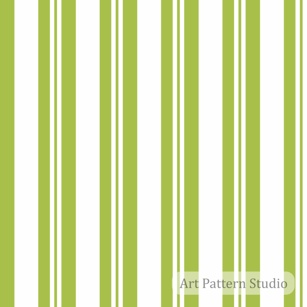
- Striped Pattern 017 – Lime Green Varied Stripe creates a stronger green rhythm through broad bands and finer supporting lines.
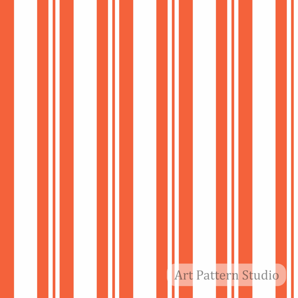
- Striped Pattern 016 – Vibrant Orange Varied Stripe puts energetic orange bands at the center of the composition, separated by clean white spaces.
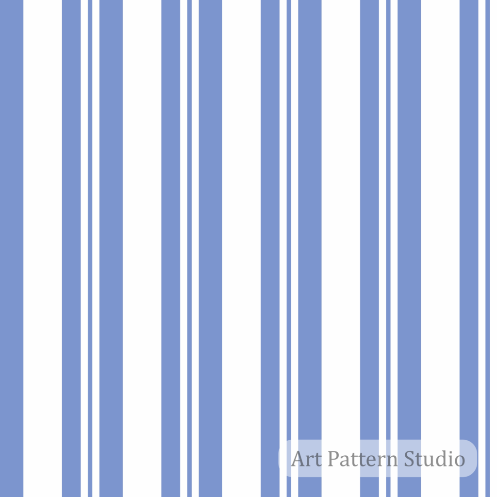
- Striped Pattern 015 – Cornflower Blue Varied Stripe balances substantial blue bands with slimmer lines, making width variation easy to study.
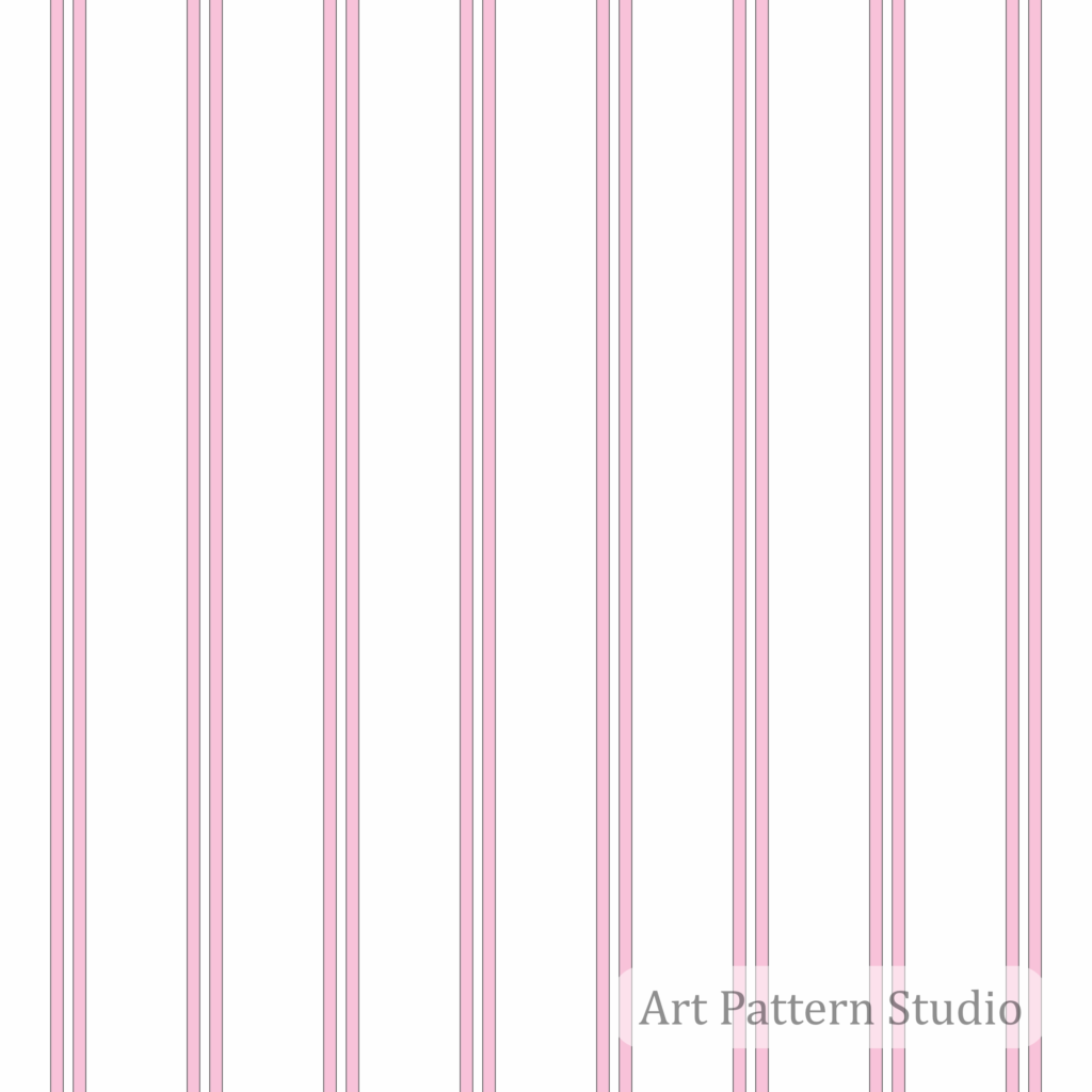
- Striped Pattern 013 – Blush Pink Double Pinstripe introduces a paired pink line system with generous white spacing for a lighter visual reading.
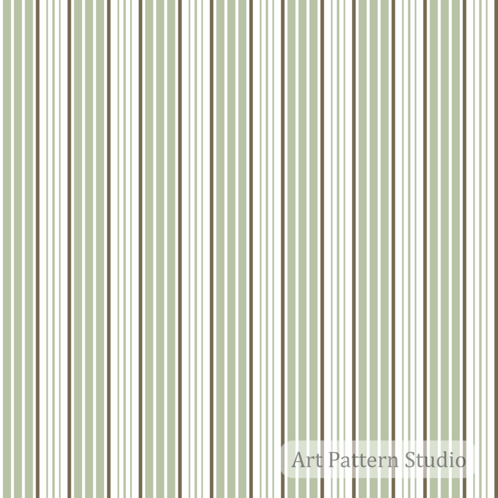
- Striped Pattern 012 – Sage Olive Fine Stripe brings muted green and neutral lines into a more intricate fine-stripe arrangement.
- Striped Pattern 006 – Royal Blue Stripe offers another blue option to compare with softer cornflower and pastel combinations.
When browsing the collection, compare each repeat at its intended product scale rather than choosing by color alone. A small tile preview cannot communicate every placement or material decision. Review the individual listing for its included files and use the artwork as a starting point for your own production sampling.
Stripes as Coordinate Patterns
A stripe can connect otherwise different prints by repeating one background or accent color. With floral patterns, use simpler line rhythms to balance organic movement. With polka dots, separate the motif scales so dots and lines do not compete.
With animal prints, a restrained stripe can organize a more irregular surface. Pairing monograms with stripes works best when the line spacing leaves the emblem readable and the palettes share an anchor.
For heritage-inspired ranges, plaids and checks already contain intersecting line systems; choose a stripe that simplifies rather than repeats their complexity. Abstract patterns can benefit from the same contrast between expressive and ordered surfaces.
The Black and White Patterns collection offers a tonal framework for mixing motifs without introducing extra hues. Build combinations on a board showing actual sizes, not identically sized thumbnails.
Professional Digital Files: Check the Individual Listing
Art Pattern Studio supplies digital artwork, not physical fabric or finished garments. The selected stripe listings above specify high-resolution JPG artwork, editable EPS vector files and a PDF license document. This does not mean every product across the store contains identical formats; the individual product page remains the reference for its delivery package.
Vector artwork can support scaling and color development in compatible software. JPG files serve raster-based workflows, subject to pixel dimensions and the final print size. Seamless artwork should still be tested at the intended scale and with the chosen printer. Digital download access becomes available after confirmed payment.
Universal License for Personal & Commercial Use
The Universal License supports personal and commercial use, including small and large-scale production of physical products and finished commercial projects. It is non-exclusive; copyright remains with Art Pattern Studio, and purchasing a pattern does not transfer authorship or intellectual-property ownership.
Do not resell, redistribute, share or sublicense the original digital pattern files as stand-alone assets. Files may be supplied to manufacturers or service providers only to carry out your authorized production, without independent resale or distribution rights. Read the current Licensing Guide for the complete terms before starting a project.
Frequently Asked Questions
What are the stripe pattern trends for 2027?
APS recommends exploring refined pinstripes, minimal lines, wide bands, varied widths, multistripes and color-led coordinates. Public SS27 research supports interest in bold stripes, refreshed shirting and lighter tailoring; the full ten-direction edit is our independent interpretation.
Are striped patterns timeless?
Yes. Their adaptable structure supports recurring uses in shirting, tailoring, casualwear and interiors. A timeless base still needs thoughtful color, scale and material choices for a specific collection.
What types of stripes are used in fashion?
Common design vocabularies include pinstripes, fine lines, broad bands, paired stripes, varied-width repeats and multistripes. Vertical, horizontal and diagonal placement can change how any of these reads on a garment.
What is the difference between pinstripes and multistripes?
Pinstripes emphasize thin lines, often against a contrasting ground. Multistripes emphasize a sequence of several colors, sometimes combined with different widths. A design can borrow characteristics from both.
How can stripe patterns be used in textile collections?
Use a stripe as a hero print, lining, smaller coordinate or link between colorways. Specify the repeat dimensions and sample the design on the intended base fabric before approving production.
Are striped patterns suitable for interior design?
They can suit wallpaper, cushions, bedding and upholstery concepts. Review scale at room distance, plan seam matching and confirm the supplier’s technical requirements for the intended surface.
Can Art Pattern Studio striped patterns be used commercially?
Yes, under the Universal License, including small and large-scale physical production. The original digital files cannot be sold or distributed as independent pattern assets.
What file formats are available?
The featured stripe listings specify EPS vector, high-resolution JPG and a PDF license document. Check each product page; do not assume the same formats are included with every design in the store.
Can striped patterns be recolored?
When an editable EPS is included, compatible vector software can support color changes. A JPG is raster artwork, not a layered vector file; selective recoloring may need additional editing and can affect quality.
How can designers combine stripes with other prints?
Share an anchor color, vary motif scale and assign one design the leading role. Test the complete combination on actual product areas to avoid competing rhythms.
Research Sources & Independent Interpretation
This article draws on accessible public reporting, not proprietary forecast reports. Sources establish context; APS independently proposes the stripe families, palettes, product applications and development checklist. These recommendations are design opportunities, not guaranteed commercial outcomes or a universal official forecast.
- Première Vision — Spring-Summer 27 Decodings: Fabrics, February 13, 2026: material and shirting context.
- Première Vision — Decoding Spring-Summer 27 key transversal highlights, February 5, 2026: broad textile directions, including bold stripes.
- Wallpaper* — These were the best shows of New York Fashion Week S/S 2027, September 16, 2026: original runway reporting, including Michael Kors.
About the Author
Written by Wesley S. Almeida
Fashion Designer, Surface Pattern Designer and Founder of Art Pattern Studio
Learn more about the studio’s design background and approach on the About the Founder page.
Explore the Striped Patterns Collection
Discover seamless stripe patterns designed for fashion, textiles, accessories and professional surface design projects.
Explore the Striped Patterns Collection · Browse All Patterns
 No products in the cart.